DOUBLE PAGE TEMPLATES
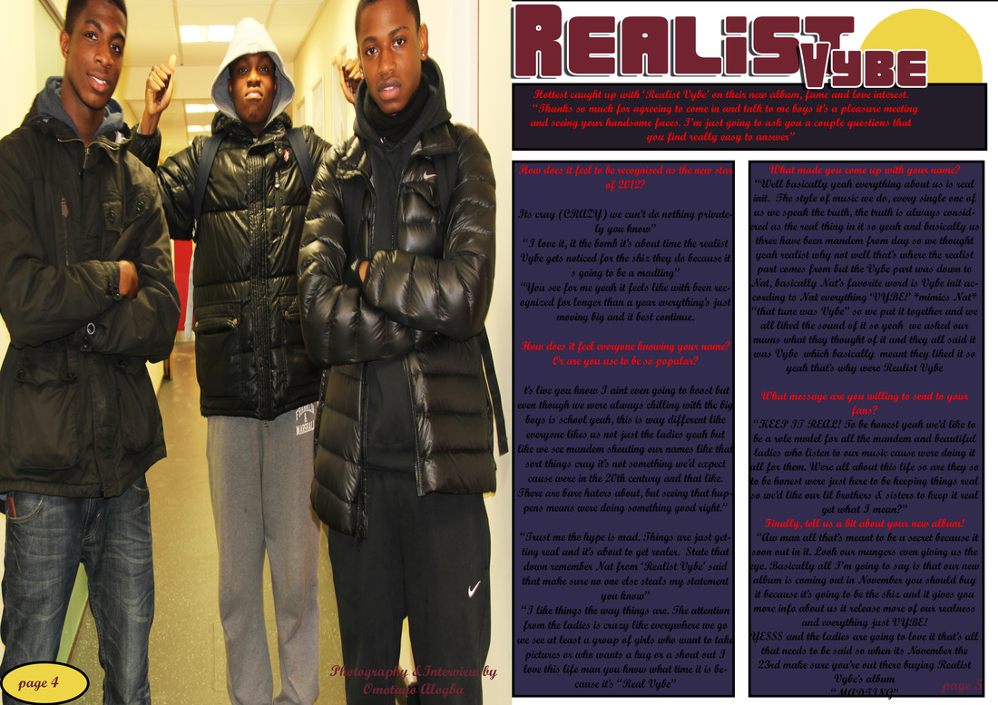
Name - Realist Vybe
Age: 16-17
Type of music – R&B/Rap
Name of the boys-
-Dan's front left ,
-Rick front right
-Jesse Back
About us- there a boys group who refer to themselves as brothers rather than a group or a clique. Although there not related by blood they've known each other from the age of 9 so as they've known each other for a long period of time it shows that they know each other inside and out. So the boys know what each would and wouldn't do. Rick is the youngest in the group and Dan's is the oldest by a few month which leaves Jesse in the middle. The boys are after the real look they portray how they were bought up and don’t hope to change anything about themselves
This is the first template for my DPS. When creating the template, it was my very first time creating any template using Photoshop, this is the reason for the white gaps in between the coloured boxes. i made a few mistakes that i will not want to include in my DPS for example the rectangle shape where the text will take place.

My second template has the main image on the left side, so it's the first thing the reader sees as they turn the page. I've also included a byline to make my magazine DPS to look more professional. I made a change by make the rectangle shape even, i will now be happy to use this layout for my final DPS.


My First Draft of my double page spread.
Here is a screenshot of my progress with my double paged spread for my music magazine. I have still kept to my original plans, with the main image on the left and the headline right, i stuck to my two column but add an extra column at the top, i believe my DPS looks professional as i have stuck to a colour scheme and every thing is in line.
Here is a screenshot of my progress with my double paged spread for my music magazine. I have still kept to my original plans, with the main image on the left and the headline right, i stuck to my two column but add an extra column at the top, i believe my DPS looks professional as i have stuck to a colour scheme and every thing is in line.